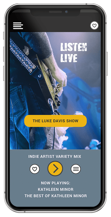
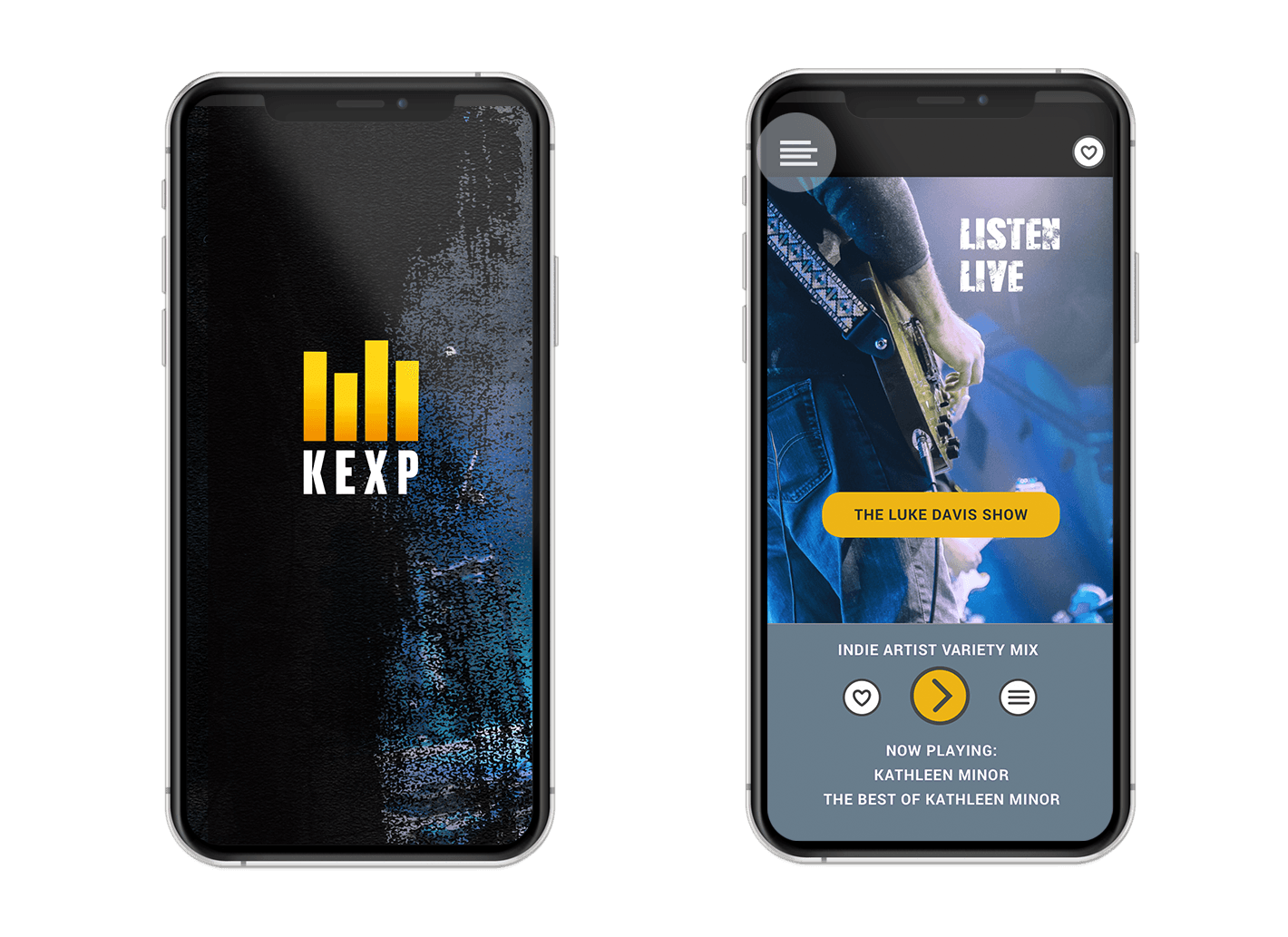
KEXP Mobile App
SCHOOL OF VISUAL CONCEPTS
UI/VISUAL DESIGN FOR APPS
BACKGROUND
KEXP 90.3 FM is a nonprofit arts organization serving music lovers through in-person, broadcast and online programming. Their mission is to enrich your life by championing music and discovery. KEXP reaches over 200,000 global listeners each week. Their YouTube channel gathers millions of views every week of their exclusive live onsite performances at the KEXP Seattle Center home stage.
CONTRIBUTIONS:
User Interface, UI & Visual Design
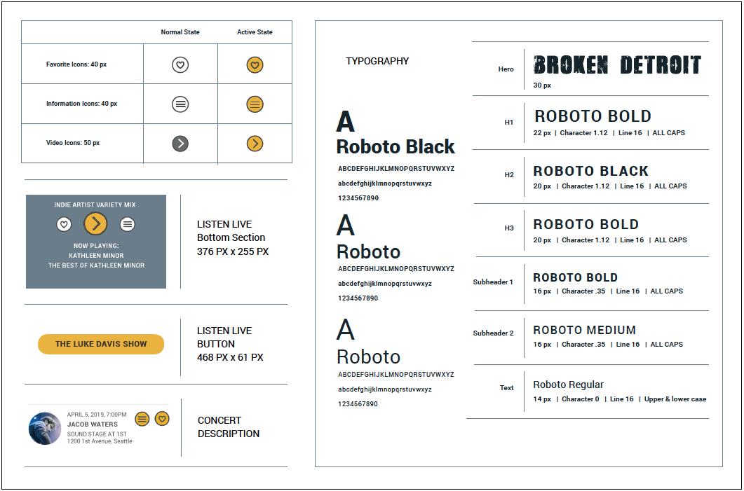
Visual Design Language System
Visual & UX Research
Branding Update
TOOLS:
Sketch, InVision, Illustrator, Photoshop
PROJECT GOALS
Project goal was to design and develop a new feature based on user
research. The goal was to integrate this new feature into the existing app,
as well as updating the visual theme. This project was completed over a 10 week course at the School of Visual Concepts as a part of the UI & Visual Design Certificate with instructor Andi Rusu.
USER RESEARCH
TALKING TO APP USERS
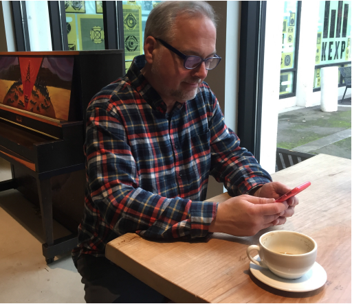
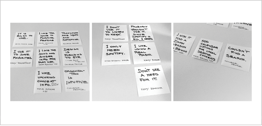
I visited the KEXP Gathering Space and talked to the receptionist, a barista and a family member who accompanied me. I also asked friends and family to test the app. Most users of the app thought it looked nice but did not see a purpose in using it. A couple of the test users said they listen to most of their music on Spotify. I also interviewed users outside of the cafe and learned that they generally thought it functioned well, but were not sure if they would bother using it on a regular basis.
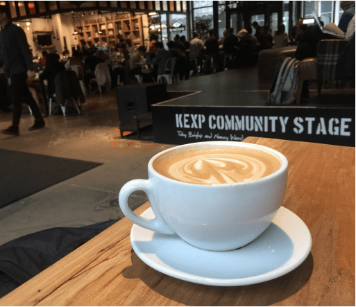
CAFE VISIT
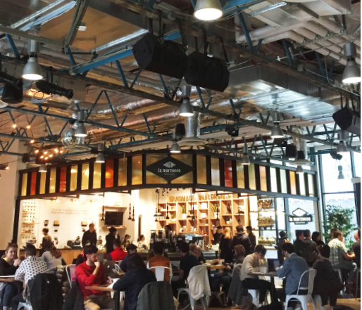
The KEXP Gathering Space has a coffee shop and café. The open layout supports their goal of creating community by providing a physical space for their listeners. The Gathering Space provides opportunities for personal and conversational engagement. The visual themes of the café and app help foster a sense of community. Feedback about the cafe itself was very positive. The NY Times recently visited KEXP and said their future looked very bright!
VISUAL CONCEPTS • MOOD BOARD
THE INSPIRATION
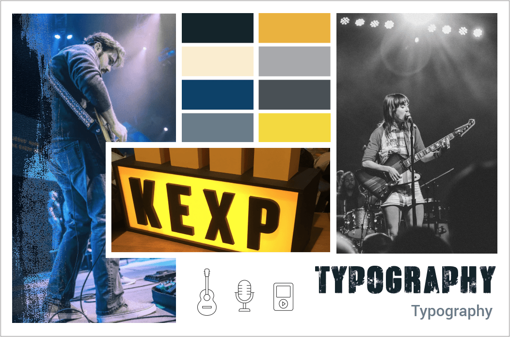
I was inspired by the history and mission of KEXP “Where the Music Matters” and by the architecture and visual images from their Gathering Space café. I was pulled towards visual themes that incorporated both the driving energy of the music and the reassuring nature of the communal place.
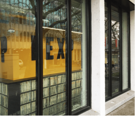
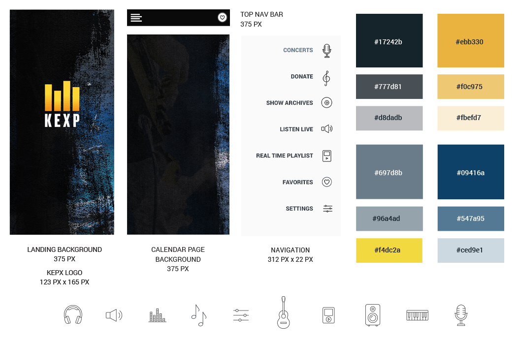
Colors were inspired by the glowing light of the iconic KEXP sign in the window. The texture was inspired by the look and feel of the painted concrete floor. The somewhat vintage overall appearance seemed integrated with modern clean icons.
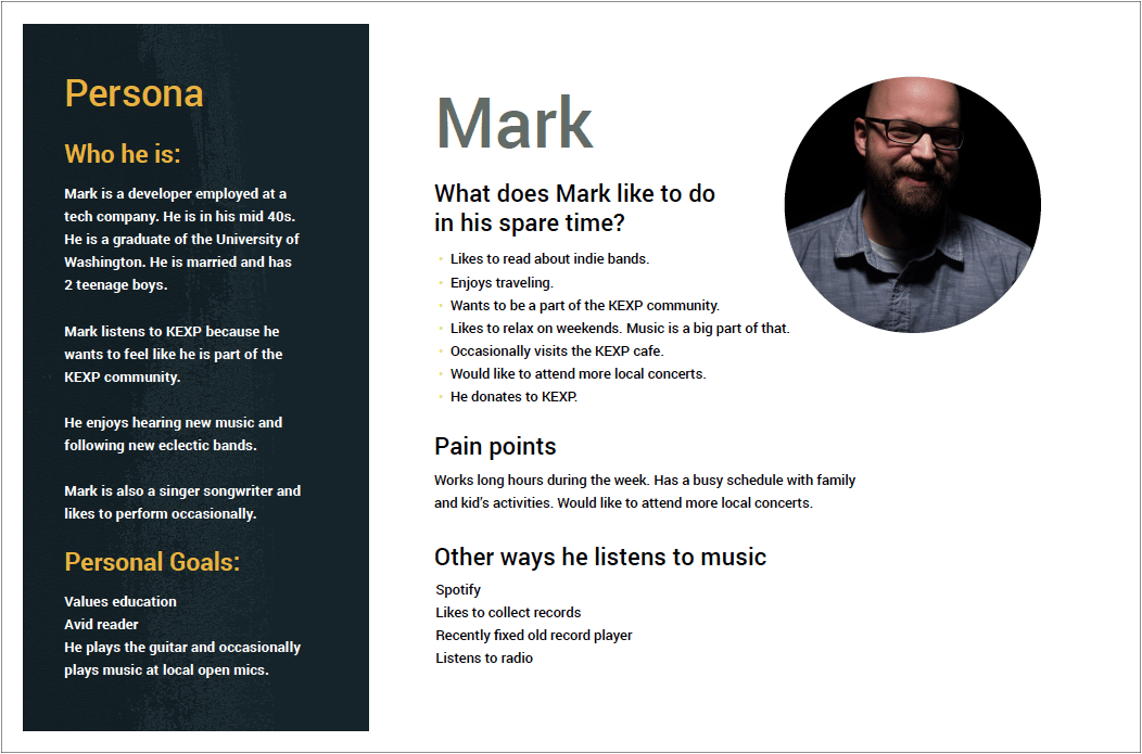
PERSONA AND USER STORIES
NEW ‘CONCERT’ FEATURE IDEA
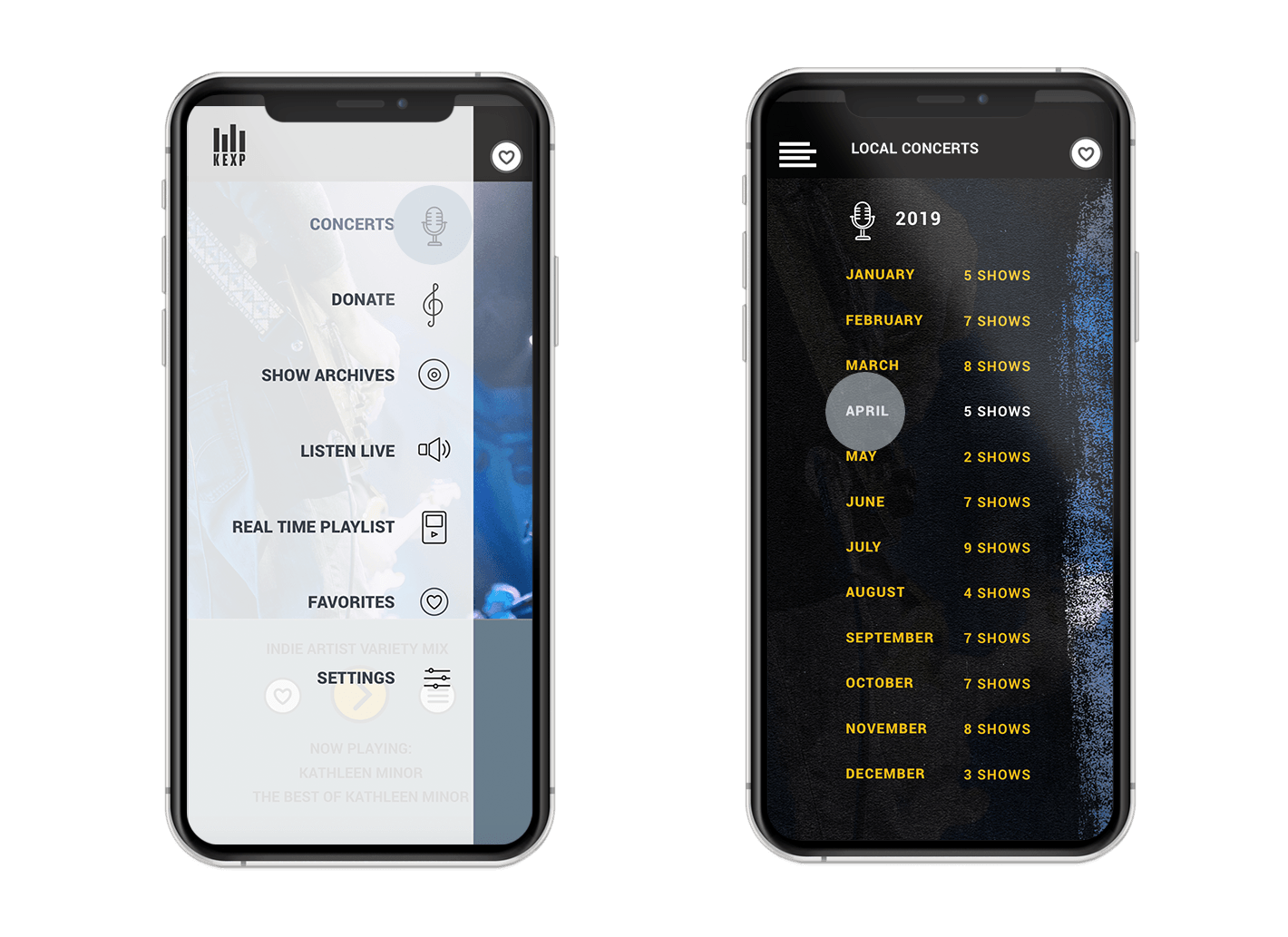
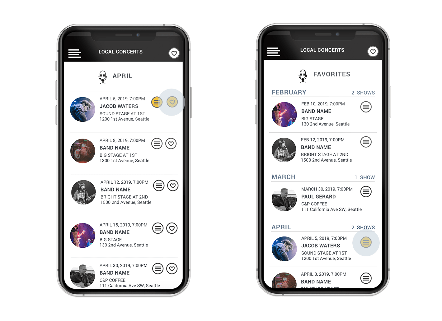
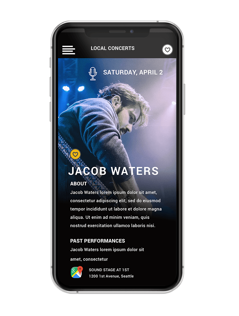
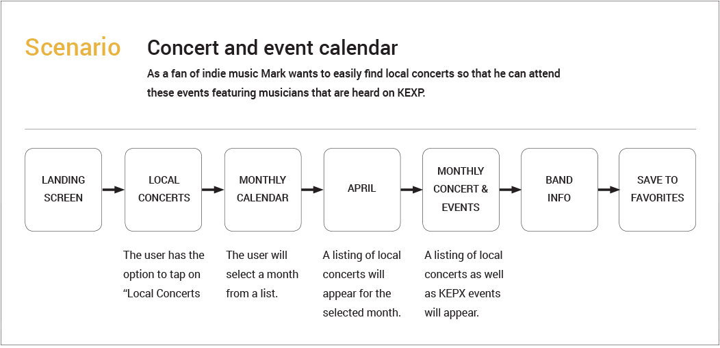
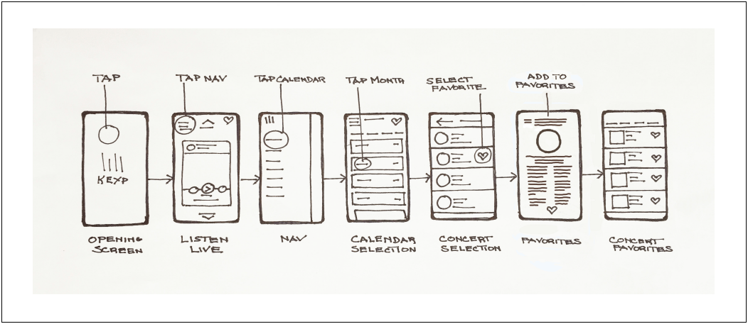
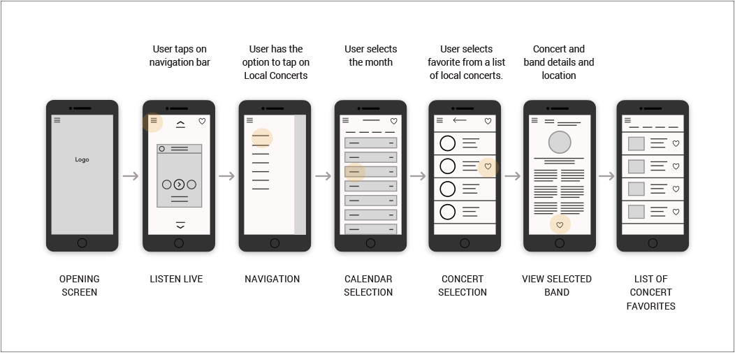
Two of the people I interviewed suggested that a "concert" app might be interesting and useful. All of the current features naturally draw one into the KEXP community. A concert app could alert listeners to offsite venues where bands featured on KEXP are performing. This would be a value-added feature for the user that would increase informational usage of the app. Based on my user research, it appeared that a new ‘concert’ feature could provide another helpful purpose for the users.
VISUAL DESIGN LANGUAGE SYSTEM


